Context
In 2015, the digital platform was stale and fragmented. Digital competitors like Le Bon Coin were pulling users away.
The whole ecosystem needed a rebuild.
Goals
Give agents faster workflow tools.
Give buyers, sellers, and renters a modern search and transaction experience.
The two sides are structurally linked: an efficient agent workflow directly feeds the listings visible to buyers.
Every design decision started from that connection.
Timeline
2015-2016
Role & Approach
I owned the design direction for the new platform. Hands-on on both sides: agent tools and the buyer-facing front, across its multiple B2C personas.
I recruited and managed two designers, plus a freelance UX designer for the search journey.
On the agency side, I was the touchpoint for Sales, Product Management, and Engineering.
Discovery & Research
Market and user research. Persona creation.
Content ranking workshops.
Interviews with prospects, clients, and agents.
Usage analytics mapped against the existing journeys to locate friction points.
Strategy Definition
The platform is a two-sided marketplace.
We structured it around key user journeys:
property search → agency contact / estimate → sell / search → buy.
Sequencing was a deliberate business decision.
We defined "activation" as an agent's first published listings and prioritized agent-side tools first.
Launching the buyer-facing front without real listings would have sent buyers straight to competitors.
Once the agent workflow had traction, focus shifted to the front.
Design Direction
Core principles: simplicity, transparency, empowerment.
The design framework had to maintain cross-platform consistency while leaving room for the brand to evolve.
Results
The agent-first sequencing worked, agent-side tools shipped first and agents started publishing.
Then the buyer-facing front launched with real listings, not an empty catalog.
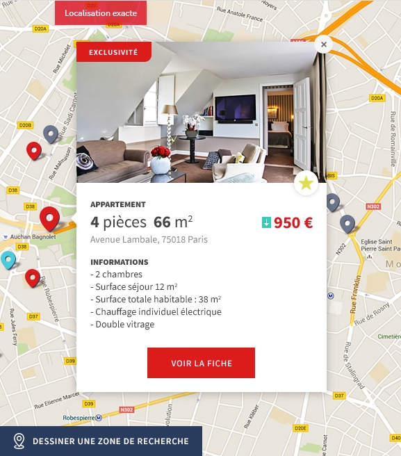
Advanced search and geolocation gave buyers a reason to start on ORPI instead of a competitor.
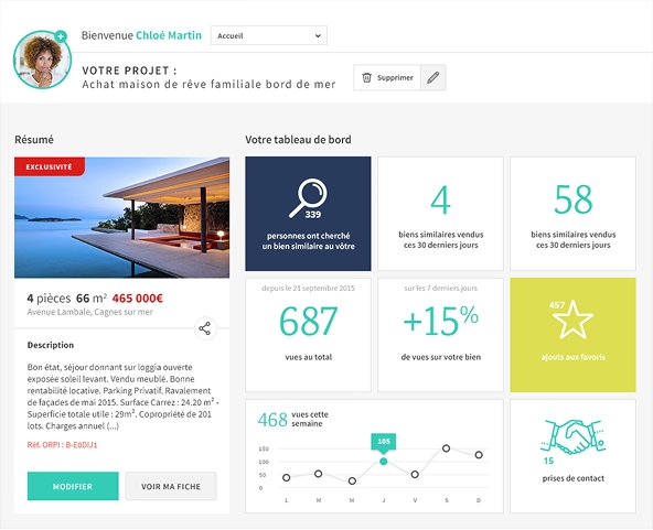
The private personal space gave sellers, buyers and returning users a reason to stay.
New services like digital valuations and free ad posting between users opened new positioning angles for the platform.
Execution
The team split by side.
One designer owned the agent-facing back-office when the other worked with me on the platform front.
Both designers ran field research on their own side.
We consolidated insights together, and had cross-design reviews twice a week, with a focus on real design feedback, not just status.
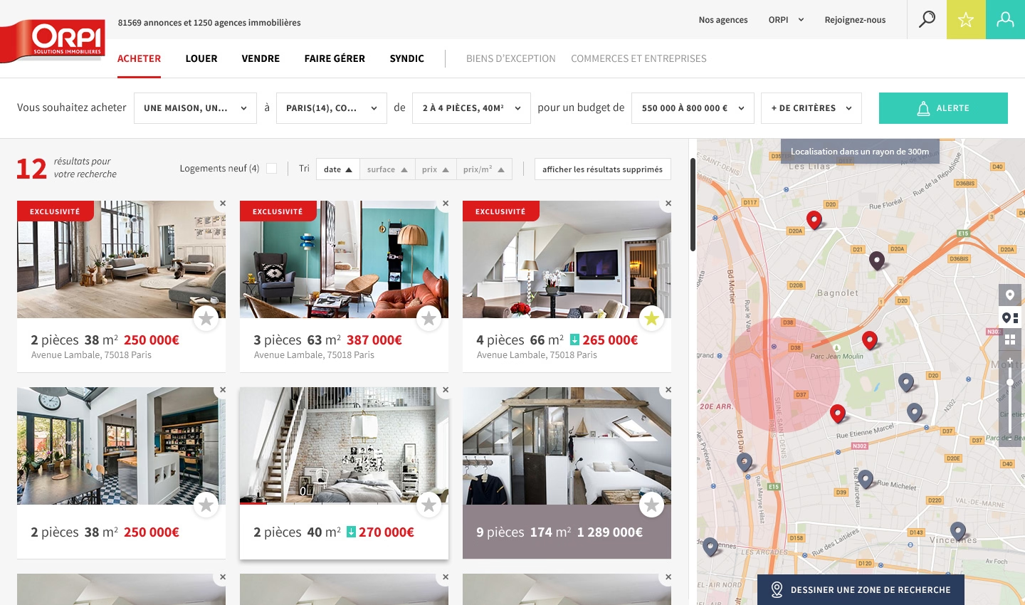
Frictions in the Search tunnel could badly damage buyers' journeys.
So when the back-office reached completion, we all switched to the front on the Search experience.
I got a contract UX designer to help us iterate on Search, and to prototype solutions user tests.
Key Decisions & Trade-Offs
We prioritized agent journey quality over feature breadth.
Focus over feature creep.
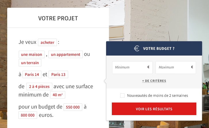
We invested in geolocation and advanced search despite the technical complexity. These were the front's strongest differentiators against Le Bon Coin and a catchup from newcomer Bien ici.
Along with a brand full digital, visual and interactive identity, page and modules templates were built as modular components.
This let us scale content and reach across local journeys (agencies, regions) without losing brand consistency.
Want to discuss this?
Other case studies
Analysis Setup Navigation
Contentsquare
The navigation problem Data Connect exposed, and the decision made to ship without fixing it.

Michelin mobile
DigitasLBI
Provide a sustainable online mobile platform for current and future needs of Michelin US and other entities.
Design sprint: MaaS
Renault Digital
A few days to help pushing forward Renault's Mobility-as-a-Service strategy.